

Matplotlib is an amazing visualization library in Python for 2D plots of arrays. Matplotlib is a multi-platform data visualization library built on NumPy arrays and designed to work with the broader SciPy stack. It was introduced by John Hunter in the year 2002.
One of the greatest benefits of visualization is that it allows us visual access to huge amounts of data in easily digestible visuals. Matplotlib consists of several plots like line, bar, scatter, histogram etc.
Installation :
Windows, Linux and macOS distributions have matplotlib and most of its dependencies as wheel packages. Run the following command to install matplotlib package :
python -mpip install -U matplotlib
Importing matplotlib :
from matplotlib import pyplot as plt
or
import matplotlib.pyplot as plt
Basic plots in Matplotlib :
Matplotlib comes with a wide variety of plots. Plots helps to understand trends, patterns, and to make correlations. They’re typically instruments for reasoning about quantitative information. Some of the sample plots are covered here.
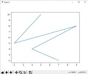
Line plot :
Output :
Bar plot :
Output :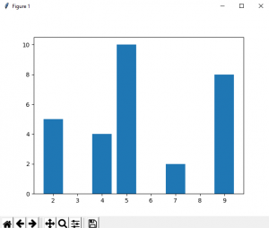
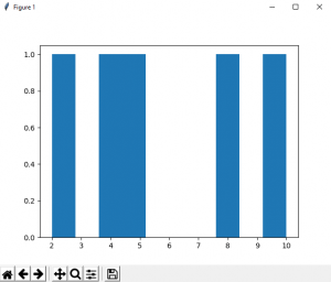
Histogram :
Output :
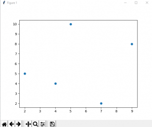
Output :
Matplotlib - Pie Chart
A Pie Chart can only display one series of data. Pie charts show the size of items (called wedge) in one data series, proportional to the sum of the items. The data points in a pie chart are shown as a percentage of the whole pie.
Matplotlib API has a pie() function that generates a pie diagram representing data in an array. The fractional area of each wedge is given by x/sum(x). If sum(x)< 1, then the values of x give the fractional area directly and the array will not be normalized. Theresulting pie will have an empty wedge of size 1 - sum(x).
The pie chart looks best if the figure and axes are square, or the Axes aspect is equal.
Parameters
Following table lists down the parameters foe a pie chart −
| x | array-like. The wedge sizes. |
| labels | list. A sequence of strings providing the labels for each wedge. |
| Colors | A sequence of matplotlibcolorargs through which the pie chart will cycle. If None, will use the colors in the currently active cycle. |
| Autopct | string, used to label the wedges with their numeric value. The label will be placed inside the wedge. The format string will be fmt%pct. |
Following code uses the pie() function to display the pie chart of the list of students enrolled for various computer language courses. The proportionate percentage is displayed inside the respective wedge with the help of autopct parameter which is set to %1.2f%.
from matplotlib import pyplot as plt
import numpy as np
fig = plt.figure()
ax = fig.add_axes([0,0,1,1])
ax.axis('equal')
langs = ['C', 'C++', 'Java', 'Python', 'PHP']
students = [23,17,35,29,12]
ax.pie(students, labels = langs,autopct='%1.2f%%')
plt.show()

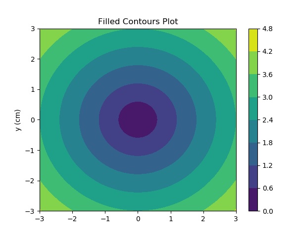
Matplotlib - Contour Plot
A contour plot is appropriate if you want to see how alue Z changes as a function of two inputs X and Y, such that Z = f(X,Y). A contour line or isoline of a function of two variables is a curve along which the function has a constant value.
The independent variables x and y are usually restricted to a regular grid called meshgrid. The numpy.meshgrid creates a rectangular grid out of an array of x values and an array of y values.
Matplotlib API contains contour() and contourf() functions that draw contour lines and filled contours, respectively. Both functions need three parameters x,y and z.
import numpy as np
import matplotlib.pyplot as plt
xlist = np.linspace(-3.0, 3.0, 100)
ylist = np.linspace(-3.0, 3.0, 100)
X, Y = np.meshgrid(xlist, ylist)
Z = np.sqrt(X**2 + Y**2)
fig,ax=plt.subplots(1,1)
cp = ax.contourf(X, Y, Z)
fig.colorbar(cp) # Add a colorbar to a plot
ax.set_title('Filled Contours Plot')
#ax.set_xlabel('x (cm)')
ax.set_ylabel('y (cm)')
plt.show()
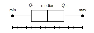
Matplotlib - Box Plot
A box plot which is also known as a whisker plot displays a summary of a set of data containing the minimum, first quartile, median, third quartile, and maximum. In a box plot, we draw a box from the first quartile to the third quartile. A vertical line goes through the box at the median. The whiskers go from each quartile to the minimum or maximum.
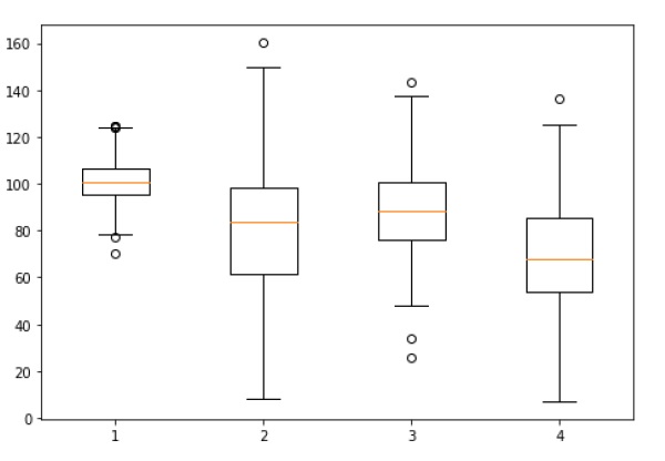
Let us create the data for the boxplots. We use the numpy.random.normal() function to create the fake data. It takes three arguments, mean and standard deviation of the normal distribution, and the number of values desired.
np.random.seed(10)
collectn_1 = np.random.normal(100, 10, 200)
collectn_2 = np.random.normal(80, 30, 200)
collectn_3 = np.random.normal(90, 20, 200)
collectn_4 = np.random.normal(70, 25, 200)
The list of arrays that we created above is the only required input for creating the boxplot. Using the data_to_plot line of code, we can create the boxplot with the following code −
fig = plt.figure()
# Create an axes instance
ax = fig.add_axes([0,0,1,1])
# Create the boxplot
bp = ax.boxplot(data_to_plot)
plt.show()
The above line of code will generate the following output −
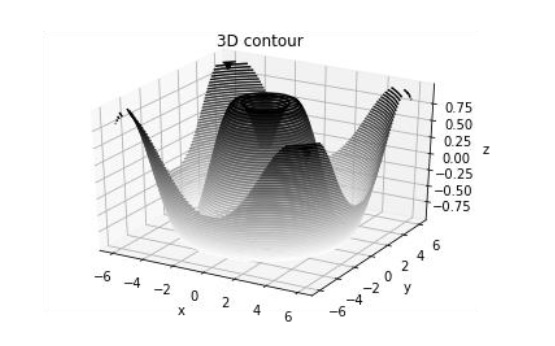
Matplotlib - 3D Contour Plot
The ax.contour3D() function creates three-dimensional contour plot. It requires all the input data to be in the form of two-dimensional regular grids, with the Z-data evaluated at each point. Here, we will show a three-dimensional contour diagram of a three-dimensional sinusoidal function.
from mpl_toolkits import mplot3d
import numpy as np
import matplotlib.pyplot as plt
def f(x, y):
   return np.sin(np.sqrt(x ** 2 + y ** 2))

x = np.linspace(-6, 6, 30)
y = np.linspace(-6, 6, 30)

X, Y = np.meshgrid(x, y)
Z = f(X, Y)

fig = plt.figure()
ax = plt.axes(projection='3d')
ax.contour3D(X, Y, Z, 50, cmap='binary')
ax.set_xlabel('x')
ax.set_ylabel('y')
ax.set_zlabel('z')
ax.set_title('3D contour')
plt.show()
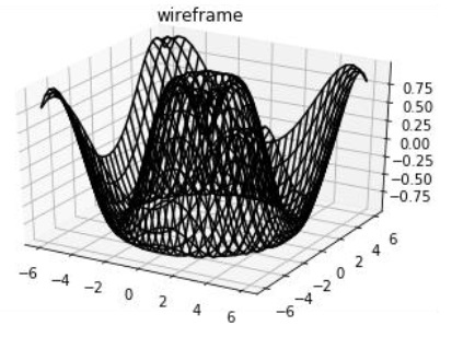
Matplotlib - 3D Wireframe plot
Wireframe plot takes a grid of values and projects it onto the specified three-dimensional surface, and can make the resulting three-dimensional forms quite easy to visualize. The plot_wireframe() function is used for the purpose −
from mpl_toolkits import mplot3d
import numpy as np
import matplotlib.pyplot as plt
def f(x, y):
   return np.sin(np.sqrt(x ** 2 + y ** 2))

x = np.linspace(-6, 6, 30)
y = np.linspace(-6, 6, 30)

X, Y = np.meshgrid(x, y)
Z = f(X, Y)

fig = plt.figure()
ax = plt.axes(projection='3d')
ax.plot_wireframe(X, Y, Z, color='black')
ax.set_title('wireframe')
plt.show()
The above line of code will generate the following output −
Matplotlib - Working with Images
The image module in Matplotlib package provides functionalities required for loading, rescaling and displaying image.
Loading image data is supported by the Pillow library. Natively, Matplotlib only supports PNG images. The commands shown below fall back on Pillow if the native read fails.
The image used in this example is a PNG file, but keep that Pillow requirement in mind for your own data. The imread() function is used to read image data in an ndarray object of float32 dtype.
import matplotlib.pyplot as plt
import matplotlib.image as mpimg
import numpy as np
img = mpimg.imread('mtplogo.png')
Assuming that following image named as mtplogo.png is present in the current working directory.

Any array containing image data can be saved to a disk file by executing the imsave() function. Here a vertically flipped version of the original png file is saved by giving origin parameter as lower.
plt.imsave("logo.png", img, cmap = 'gray', origin = 'lower')
The new image appears as below if opened in any image viewer.

To draw the image on Matplotlib viewer, execute the imshow() function.
imgplot = plt.imshow(im
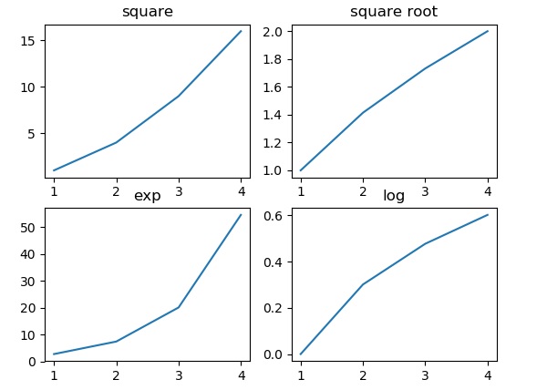
Matplotlib - Subplots() Function
Matplotlib’spyplot API has a convenience function called subplots() which acts as a utility wrapper and helps in creating common layouts of subplots, including the enclosing figure object, in a single call.
Plt.subplots(nrows, ncols)
The two integer arguments to this function specify the number of rows and columns of the subplot grid. The function returns a figure object and a tuple containing axes objects equal to nrows*ncols. Each axes object is accessible by its index. Here we create a subplot of 2 rows by 2 columns and display 4 different plots in each subplot.
import matplotlib.pyplot as plt
fig,a =  plt.subplots(2,2)
import numpy as np
x = np.arange(1,5)
a[0][0].plot(x,x*x)
a[0][0].set_title('square')
a[0][1].plot(x,np.sqrt(x))
a[0][1].set_title('square root')
a[1][0].plot(x,np.exp(x))
a[1][0].set_title('exp')
a[1][1].plot(x,np.log10(x))
a[1][1].set_title('log')
plt.show()
The above line of code generates the following output −
تعليقات
إرسال تعليق
POST Answer of Questions and ASK to Doubt